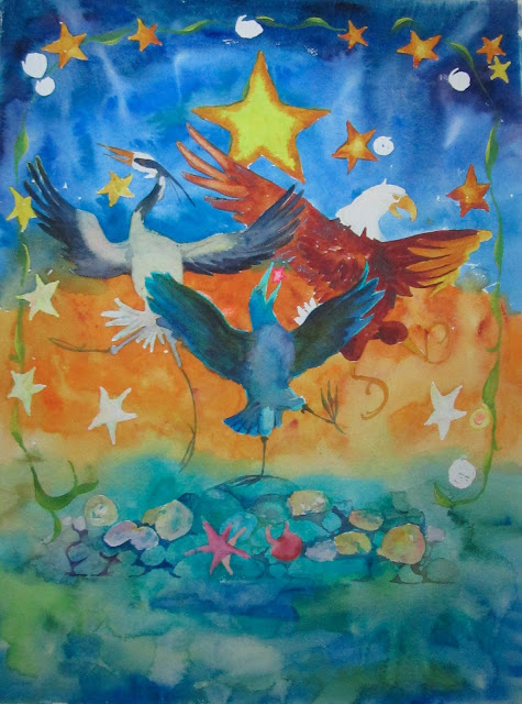
It started with just the roughest sketch of an idea. I knew what I wanted, I could see all the colors in my mind's eye. All I had to do was get in down on paper.
Step one - lay out the main shapes and apply masking, then put down the washes of color. New for me - color straight from the tube. New Gamboge, Cobalt Teal, Ultramarine, Cobalt. Laid down very wet on wet, and used a spritzer to get movement.
A BIG change-up here -- no pen and ink-work, at all. Instead, I re-discovered a treasured paintbrush - my #6 Dragon's Tongue. Such a sharp point, it almost works like a pen. I used it and a combination of Ultramarine and Purple to get my deep "blacks" and to do my line work. It worked great!
Choochokam is a Hopi, First People's, word which means "A Gathering of Stars".
Here the Heron, Eagle and Crow, iconic Langley characters and symbols, dance for joy along the edge of the sea, among the gathering stars.
I am hoping that the plans for all the "swag" at Choochokam pan out because they are all great. This is the proposed small graphic for the front of the t-shirts, with the full color graphic on the back.
I hope that's the way it works out. I hope, I hope.
I got totally impatient waiting for the graphics people to come up with and show me their lettering layout for the poster, so I made my own. This is what I would have done if it had been left to me. Now all I have to do is wait to see what the professionals do. We'll see how close they come to my vision!


No comments:
Post a Comment